Manage your Money with Python
Date
Jun 10, 2024
Category
Projects & Lifestyle

There was a time when we used to write down all the transactions we made, either on a notebook, a spreadsheet or an app, to understand how we spend our money. Well, this method could be quite time-consuming, it takes effort and it requires consistency.
This article aims to provide you with a consolidated financial habit to efficiently keep your spending in check. In case you are a beginner Python programmer I hope this article will also inspire you with a practical use case that you can personalize in line with your own needs.
If you prefer a video format, make sure to check the content of this article on my YouTube channel
Problem Statement
Some of us use mobile apps to check how we spend our money. Personally, to track my expenses I use Yolt, an app that allows you to put all of your bank accounts in one place thanks to open banking.
What you may have realized is that Yolt and digital banks’ apps like Revolut or Monzo still have limitations in terms of how you can customize your finances’ reports. For example, Yolt currently doesn’t allow you to edit the categories of your expenses and so you can’t group Lunch, Eating out and Takeaway into one single Food category. Moreover, the app might put your gym membership under Groceries or your flight purchase under Personal care. Surely this will not help you to keep in touch with your spending.
So how can we bring our Money Management to the next level?
Solution
One way of solving this problem is by using Python to manipulate our transactions data and create a personalized monthly report of our finances, categorizing expenses in the best way that resonates with you. What we need to do is to gather monthly data and to choose our expenses’ categories (only when running the code for the first time).
You can find the whole script at this link. You can access it to better follow along or to edit the code depending on your needs.
Before starting it is important to note that the benefit of budgeting is not in creating neat graphs or dashboards. These are means to make you identify your worst spending areas and help you get better control over them. The real value is not in the chart. The real value is in how that chart changes your behavior.
Let’s see how we can better manage our money using the following 5 Steps.
Step 1: Import Python Libraries
First thing first, we need to import the Python libraries that we are going to use. A library is a collection of functions and methods that allows you to perform different actions.
Step 2: Get the Data
Then we need to get all our transactions data. This can be done by downloading your transaction data from your online banking into a csv file (most of the banks allow you to do this from their app).
In case you have multiple bank accounts or if you can’t download your transaction data from your online banking I’d suggest you to use Yolt. With this app you can get all your accounts in one place and easily download a csv file with all your transactions (within the app just head to the More tab, Privacy Settings and then tap on Download your information).
Since I’d like to make this article accessible to all of you, regardless of the bank accounts and app you have, the csv file we are going to use will simply have 6 columns (id, date, amount, description, merchant and category) and will look like the screenshot below. For the purpose of this exercise, I’m using only two different bank accounts but you can add as many as you’d like to. Let’s translate our transaction data into a Pandas DataFrame.
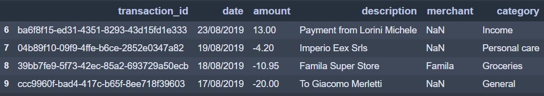
Subset of the DataFrame used in this exercise
In this subset of the DataFrame, we can see already that there are transactions that are categorized in the wrong way (e.g. payment from a friend labelled as Income…). We are going to fix this in the next steps.
Step 3: Manipulate the Data and Customize your transactions’ categories
By following this step you can edit your data and personalize the way you want to manage your transactions.
Step 3.1: Remove rows containing specific strings
With this simple line you can remove all the rows containing a specific string in a certain column (you can then repeat the command as many times you want to remove other rows). In the example below I remove all the transactions that I do to move money from one bank account to another, which my app labels as Internal.
Step 3.2: Define all your transactions‘ categories
Now it’s time to define the buckets which all the transactions should fall into. In my case I chose to use 14 categories:
Income
Entertainment
Food
Rent&Bills
Travel
Transport
Sport
Transfer
Materialistic Desire
Cash Withdrawal
Gifts
Groceries
Personal care
Other
Step 3.3: Assign transactions to the correct category
After you have defined all the transactions’ categories you want to use to manage your money, we can start identifying the transactions that are wrongly labelled in the DataFrame and assigning them to the correct category. This is key to shape your final report in the way that best fits your needs.
One way of doing it is again by locating the rows containing a specific string and assign those to a certain category (e.g. all the rows containing Uber, Zipcar or Bird should go under Transport category*).*
Additionally, with the following command, you can also reassign transactions starting with a specific string to a particular category. For example, I’m moving all the transactions with the description starting with “To “ to the Transfer category.
Step 3.4: Change the categories’ names
To change the existing categories with the ones that we have defined in the previous step we can use the following line of code. As mentioned, an example would be to assign all the transactions related to eating/drinking to a single Food category.
Step 4: Design your Monthly Report
After completion of Step 3, we should now have a clean DataFrame that has transactions aggregated by the categories that make more sense to us. We are now ready to design our monthly report, which will consist of 3 different charts.
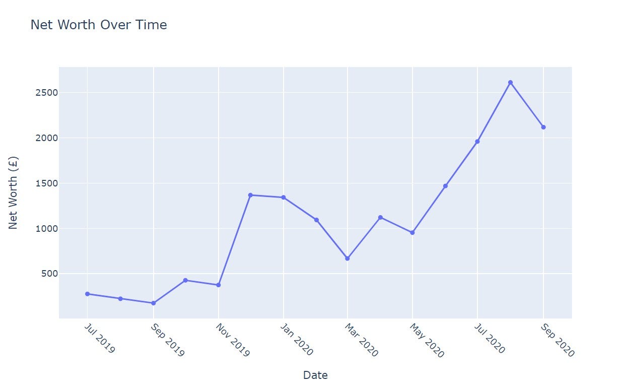
Step 4.1: Net Income Over Time Chart
The first chart that we are going to create will show how our Net Income (Income minus Expenses) changes over time.
Let’s add a column to get the year and month of the transaction (since we want to create a monthly report). Then, to create the first graph we simply need to group the DataFrame by the year_month column that we have just created and add a column with the cumulative sum of the amounts.
By using Plotly Go Library we can create a line graph with Net Income on the Y-axis and Date on the X-axis.
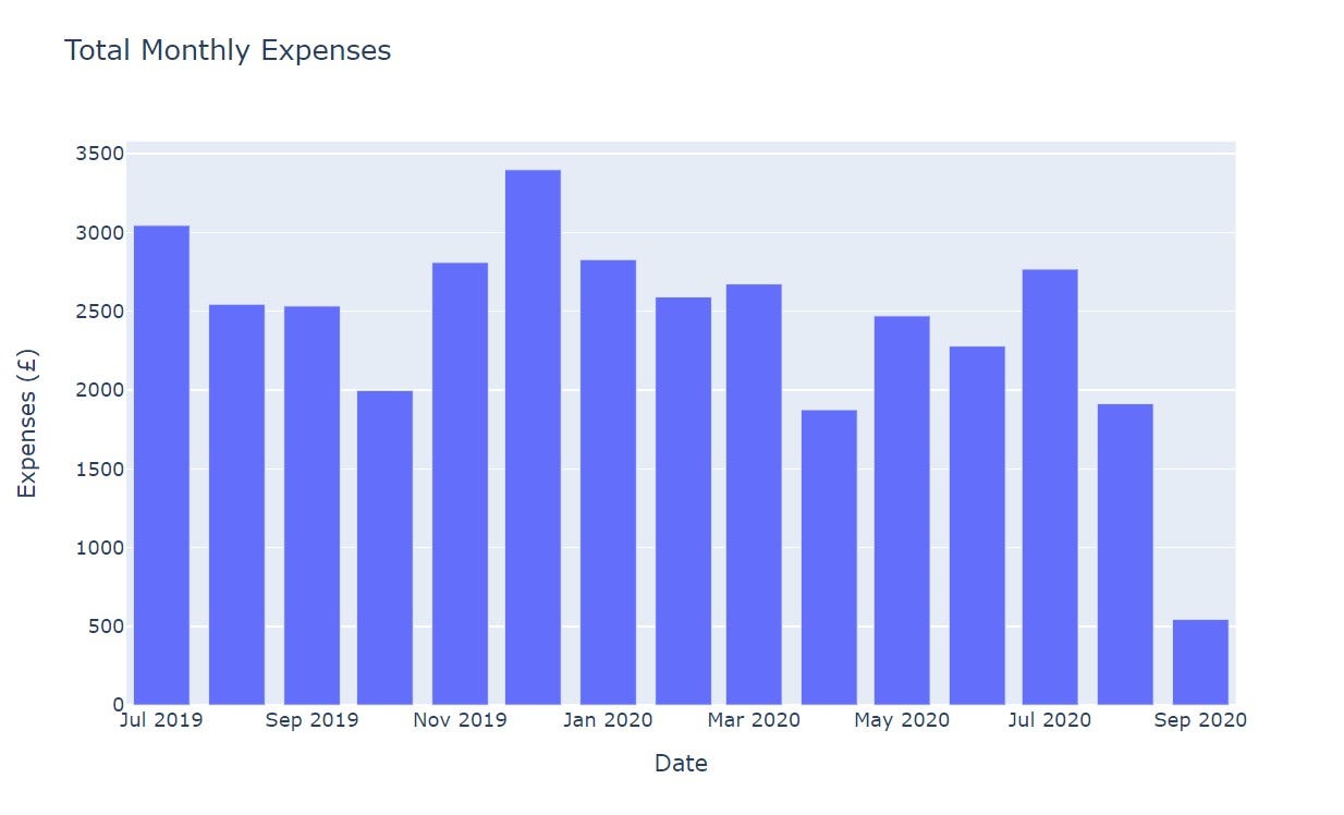
Step 4.2: Total Monthly Expenses Chart
With the second chart, we want to show how the sum of all our expenses changes every month. This will help us to understand if our monthly spending exceeds our budget as well as comparing it with previous months.
Again we are going to group the DataFrame by the year_month column, only after having removed all the transactions labelled as Income.
Then, by using the Plotly Express Library we can create a bar chart with Expenses on the Y-axis and Date on the X-axis.
Step 4.3: Expenses Breakdown Chart
The last chart we want to create will give us a clear idea of how we spent our money, dividing our spending by the categories that we have defined in Step 3.2.
In order to do this, we will just pivot our DataFrame to get the sum of the expenses for a specific month and category.
With the result of that, we will then create a simple line chart again with Expenses on the Y-axis and Date on the X-axis as shown below.
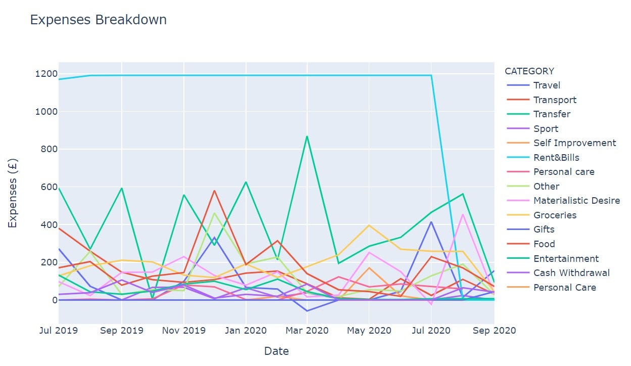
Negative Expenses relate to refunds
Step 5: Build the Final Dashboard
Now that we have created 3 different charts showing our Net Income, Monthly Expenses and their Breakdown, we just need to combine them in one single Dash ****App which will run on your local laptop.
Within the Dash App, you can see the details of each data point by hovering the mouse and filter down the categories that you want to display in the chart.
That’s it, you now have your Final Dashboard!!

Conclusion
I hope that this article will help you as much as it helped me, both to put yourself in control of your money and to reveal some of your worst spending habits.
After you build up some entries, start looking at the patterns and see what they’re telling you about sensible changes you can make to your spending. Hopefully, this will show you how consolidated financial habits can have an enormous impact on your use of money.
This article could be a starting point for you to add more charts to your own report as well as making the dashboard more interactive. For example, a chart showing the details of each category could make you more mindful of your expenses. Another idea to improve the code would be to automate how we gather transactions information, which could be done by using Web Scraping to get the data directly from your online banking page.
Please do reach out to me with all the suggestions and comments you may have.
Thanks for reading!
If you like this content, make sure to check out my YouTube channel below for more!

